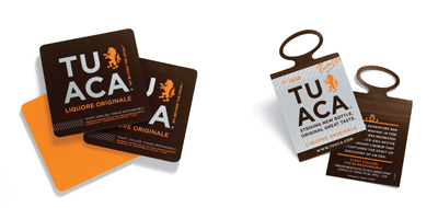
Tuaca Liquor Branding & Packaging

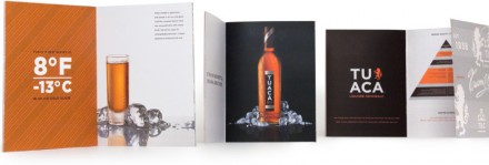
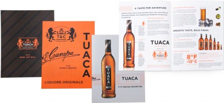
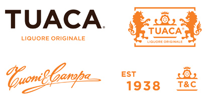
I’ve had a sweet spot for Tuaca, a vanilla flavored tequila, for quite some time. Shaken with ice and taken straight, it’s just delicious. The people at CUE were tasked with rebranding the beverage and what a damn good job they did. This is a full on soup to nuts branding initiative and it’s truly well done. The typography rests with GOTHAM, a favorite of many designers, including myself. Heck, i used it for The Gas Station Kitchen & Bar branding quite thoroughly. Here’s what Cue says:

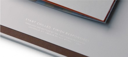
To be relevant, brands need to get noticed, speak in a consistent voice and engage in interesting ways. More and more, brands are activated at the local level. To provide tools and communicate with the field, the Tuaca brand activation guide provides branding elements and programs, packaged in a cool, Tuaca way.

Discuss this Project

Leave a Reply

This site uses Akismet to reduce spam. Learn how your comment data is processed.

The Forktales Podcast™: Interviews with restaurant industry leaders and visionaries

Restaurant and advertising industry headlines and thinking

Reviews of restaurant experiences from around the globe 

Reviews of our favorite design, business, & restaurant books

Our favorite typography and fonts

Inspiration in your inbox

Get the latest inspiration in your inbox every Monday morning, for FREE!

"*" indicates required fields

This field is for validation purposes and should be left unchanged.

Delicious Bits in your Inbox!

Get the latest and greatest content delivered to your inbox for free!

"*" indicates required fields

This field is for validation purposes and should be left unchanged.