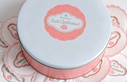
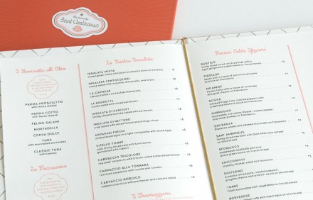
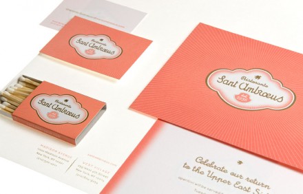
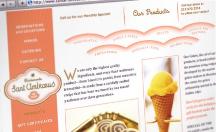
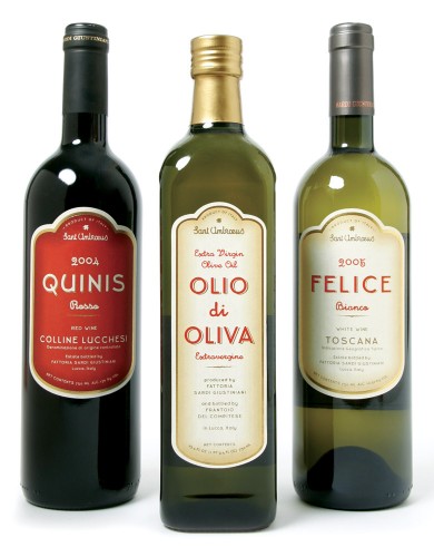
A long standing restaurant icon moves to the states and needs a brand that will speak of its history and its inviting nature. This brand works because it uses a nontraditional color set that’s easing, subtle, yet very different and new. The typography is the perfect accompaniment with it’s simple flowing script. It’s not overdone, just well done.
From the Mucca Design Team:
We created a brand identity system for the restaurant that conveys the establishment’s venerable history, preserving their historical logotype and drawing inspiration from their vintage confectionary wrapping paper. Two custom typefaces give a 1930s flavor to menus and packaging, and a rich pink and gold color palette makes their sweet treats and gelato hard to resist. The brand extended to wine and olive oil labels, cookie tins, and gelato cups, as well as an e-commerce website allowing the client to extend their business nationwide.

