Fabrikk Restaurant Branding

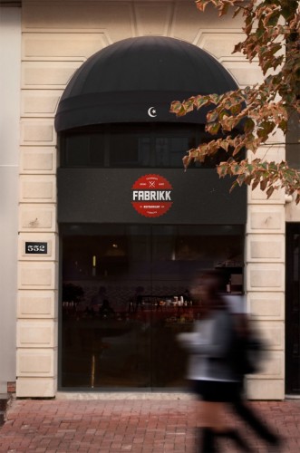
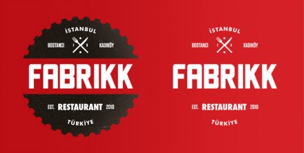
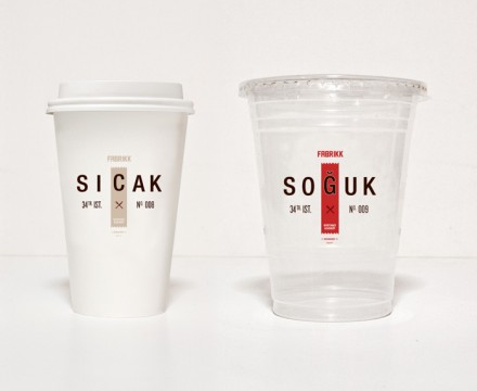
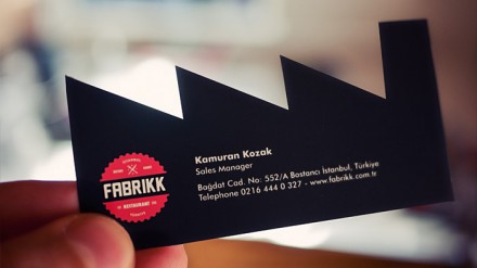
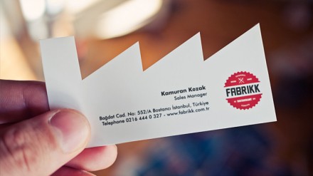
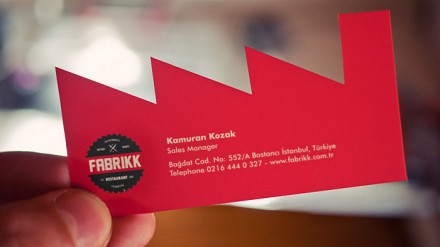
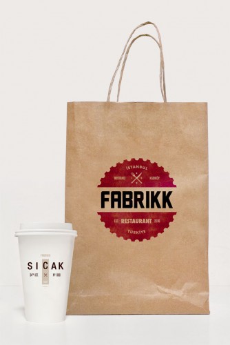
This identity has made its rounds around the webspace, and for good reason. It’s very well done and a superb example of a Constructivist style made modern. The business cards are eye catching and different. The rest of the identity touts strong typography, limited color palette and generally lets the simplicity speak for itself. Designed by Salih Kucukaga, he describes the angle:

Identity design for an Istanbul based restaurant where you can have delicious meals in a young, vintage style factory atmosphere
with an urban feel. Fabrikk comes from the latin word Fabrica which means “Factory” in English.

Discuss this Project

Leave a Reply

This site uses Akismet to reduce spam. Learn how your comment data is processed.

The Forktales Podcast™: Interviews with restaurant industry leaders and visionaries

Restaurant and advertising industry headlines and thinking

Reviews of restaurant experiences from around the globe 

Reviews of our favorite design, business, & restaurant books

Our favorite typography and fonts

Inspiration in your inbox

Get the latest inspiration in your inbox every Monday morning, for FREE!

"*" indicates required fields

This field is for validation purposes and should be left unchanged.

Delicious Bits in your Inbox!

Get the latest and greatest content delivered to your inbox for free!

"*" indicates required fields

This field is for validation purposes and should be left unchanged.