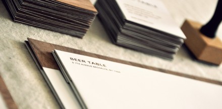
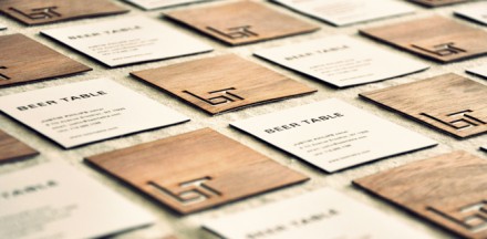
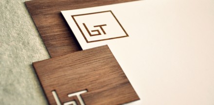
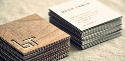
The Beer Table’s logo is a monogram that works as a mnemonic device. The b and t letters form an actual seat and table making it easily understood at first glance. The design plays heavily on the natural wood textures and even the business cards are crafted from wood. I believe this wouldn’t be very cost effective, but the design thinking is there and that’s what makes this a great design by Jay Ressler.

Discuss this Project

Leave a Reply

This site uses Akismet to reduce spam. Learn how your comment data is processed.

The Forktales Podcast™: Interviews with restaurant industry leaders and visionaries

Restaurant and advertising industry headlines and thinking

Reviews of restaurant experiences from around the globe 

Reviews of our favorite design, business, & restaurant books

Our favorite typography and fonts

Inspiration in your inbox

Get the latest inspiration in your inbox every Monday morning, for FREE!

"*" indicates required fields

This field is for validation purposes and should be left unchanged.

Delicious Bits in your Inbox!

Get the latest and greatest content delivered to your inbox for free!

"*" indicates required fields

This field is for validation purposes and should be left unchanged.