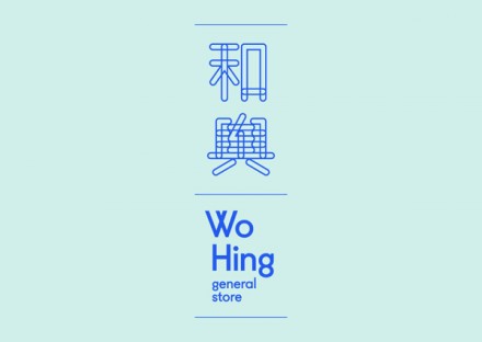
Wo Hing Grocery Branding

Wo Hing’s brand features excellent, vibrant photo treatments that visually say “food” without being blatant and mundane. With bright blues and seafoam greens, Wo Hing stands out from tradition restaurant brands. Combine the color palette with simple characters and modern, clean layout and Wo Hing has as strong restaurant brand that stands out. Designed by Manual.

Discuss this Project

2 Responses

Leave a Reply

This site uses Akismet to reduce spam. Learn how your comment data is processed.

The Forktales Podcast™: Interviews with restaurant industry leaders and visionaries

Restaurant and advertising industry headlines and thinking

Reviews of restaurant experiences from around the globe 

Reviews of our favorite design, business, & restaurant books

Our favorite typography and fonts

Inspiration in your inbox

Get the latest inspiration in your inbox every Monday morning, for FREE!

"*" indicates required fields

This field is for validation purposes and should be left unchanged.

Delicious Bits in your Inbox!

Get the latest and greatest content delivered to your inbox for free!

"*" indicates required fields

This field is for validation purposes and should be left unchanged.