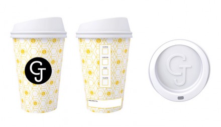
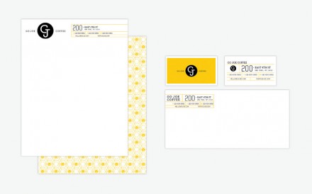
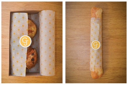
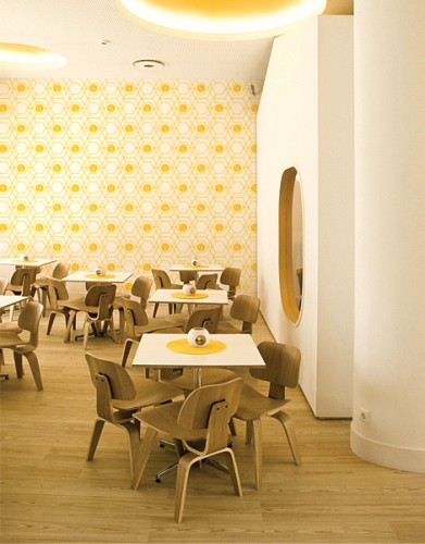
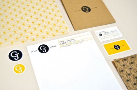
In the branding world, sometimes the mantra of “less is more” is forgotten. Haruko Hayakawa didn’t forget that in his branding and design for Go Joe Coffee. The color yellow is frequently misused or not used at all, but Hayakawa uses it wonderfully in his presentation of Go Joe. It’s the primary color of his design and in combination with the GJ logo, it creates an impression of light and airy, not always characteristics associated with coffee. Go Joe moves away from the seriousness that some coffee brands handle themselves with and the result is an approachable and comfortable brand of coffee, something that easily sells in the world of complicated coffee shops, menus and orders. The honeycomb pattern of the design that is featured on cups, paper products and on the walls of the shop is complex enough to engage the eye, but not overtly dominating. The use of yellow inside the shop is a brilliant twist, creating a welcoming and bright atmosphere. That’s the kind of atmosphere most folks wouldn’t mind walking into in the morning to start their day.