La Brea Bakery branding

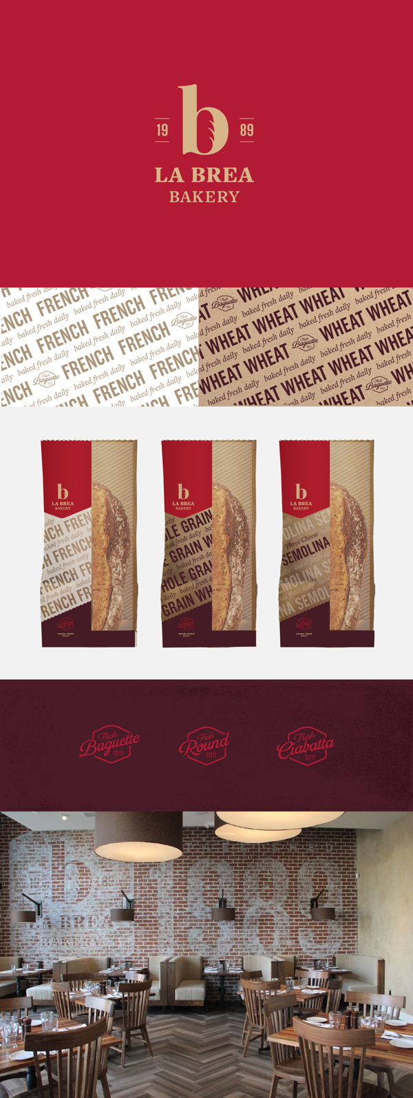
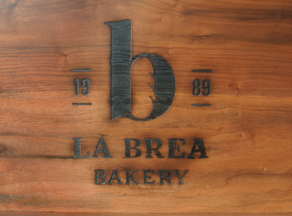
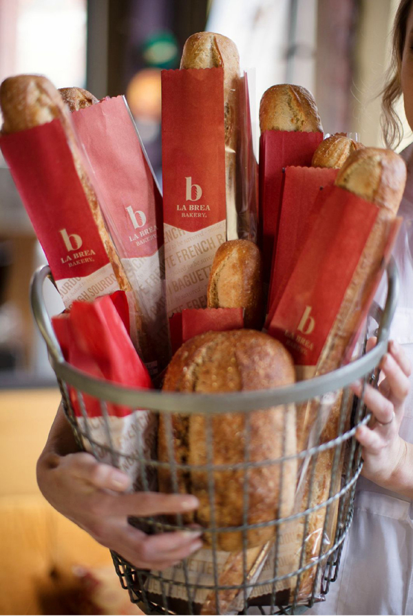
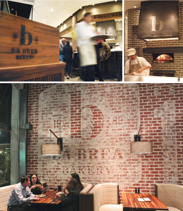
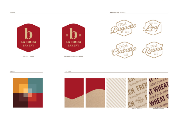
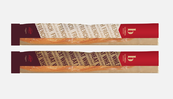
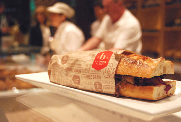
The brand identity for La Brea bakery leverages the vibrant strength of the color red and the natural warmth of wood tones to convey its vibe. The witty logo uses a “b” form with a bread icon nestled in the negative space. It intelligently updates the brand without losing it’s rich historical roots.

Agency: Hornall Anderson
Team: David Bates, Lauren Dirusso, David Phillips, Rob Zweibel
Photography: David Estep, Manolo Langis
Architects: SFJones

3e91eba2184fb07e45b8ff2936ad82e1


54dbc8f45e69db72419eb20e2846ee14

70cb96cdc6c39395b2604d6c379d4e70

961bf8972b0718f3b3d5248c76880e3a

1565efb2d9946dba1d7eab7aa1251405

c0e5023e84b7d795255145f7e850267f

f987a1b2f90921a1ed0f16dedc344106

Discuss this Project

Leave a Reply

This site uses Akismet to reduce spam. Learn how your comment data is processed.

The Forktales Podcast™: Interviews with restaurant industry leaders and visionaries

Restaurant and advertising industry headlines and thinking

Reviews of restaurant experiences from around the globe 

Reviews of our favorite design, business, & restaurant books

Our favorite typography and fonts

Inspiration in your inbox

Get the latest inspiration in your inbox every Monday morning, for FREE!

"*" indicates required fields

This field is for validation purposes and should be left unchanged.

Delicious Bits in your Inbox!

Get the latest and greatest content delivered to your inbox for free!

"*" indicates required fields

This field is for validation purposes and should be left unchanged.