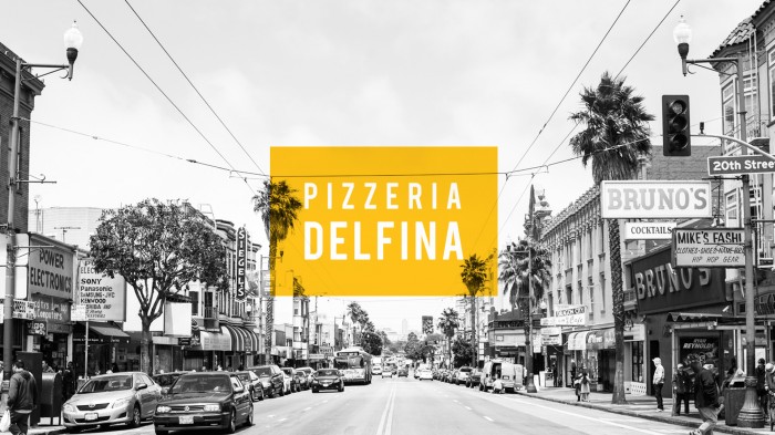
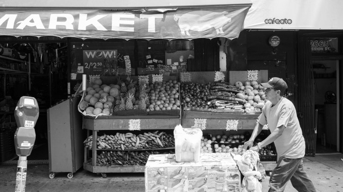
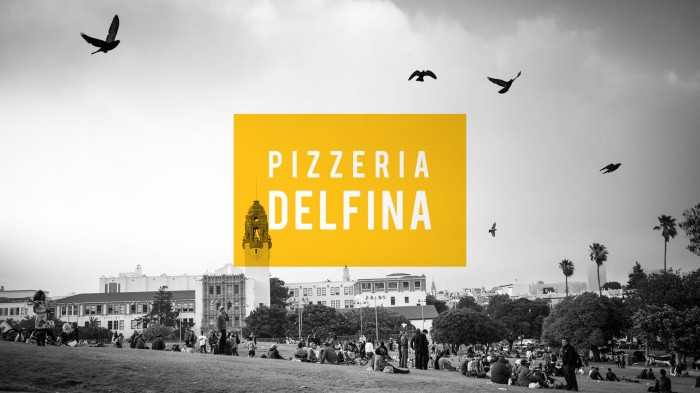
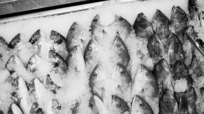
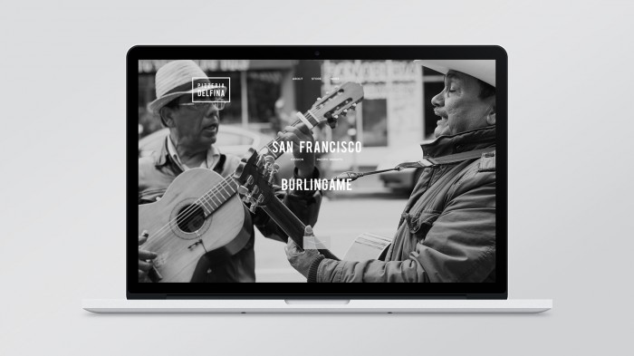
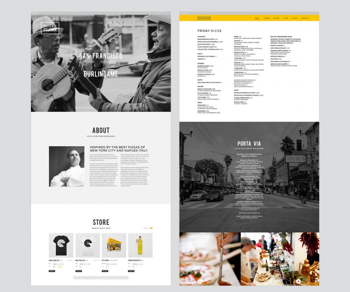
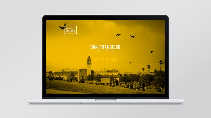
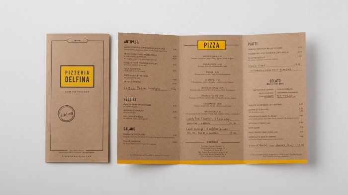
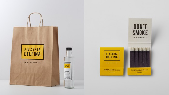
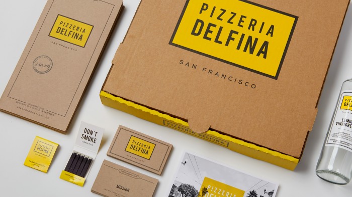
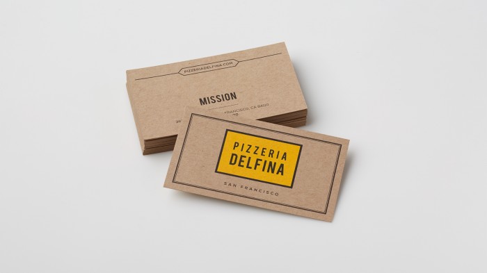
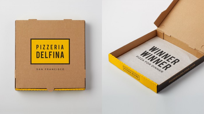
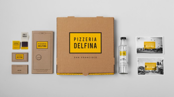
The simple color palette that marks Pizzeria Delfina’s brand identity combines nicely with the high contrast black white photography, and natural textures from the materials. The slightly orange yellow splashes overtop the imagery making for an excellent visual language. Every touch point has been considered. Although it may seem like the logo is mindlessly slapped on things, upon further scrutiny you can see that the simplicity of the application is what makes it so excellent. Things have been thought through even down to little surprises like the paper in the pizza box. Designed by Character.

m_delfina_branding1

delfina_photography_31

delfina_photography_4

delfina_photography_12

delfina_photography_5

delfina_website_11

delfina_website_31

delfina_website_21

delfina_branding_41

delfina_branding_61

delfina_branding_7

delfina_branding_31

delfina_branding_51

delfina_branding_21

Discuss this Project

Leave a Reply

This site uses Akismet to reduce spam. Learn how your comment data is processed.

The Forktales Podcast™: Interviews with restaurant industry leaders and visionaries

Restaurant and advertising industry headlines and thinking

Reviews of restaurant experiences from around the globe 

Reviews of our favorite design, business, & restaurant books

Our favorite typography and fonts

Inspiration in your inbox

Get the latest inspiration in your inbox every Monday morning, for FREE!

"*" indicates required fields

This field is for validation purposes and should be left unchanged.

Delicious Bits in your Inbox!

Get the latest and greatest content delivered to your inbox for free!

"*" indicates required fields

This field is for validation purposes and should be left unchanged.