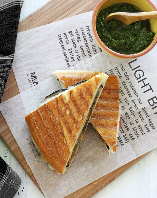
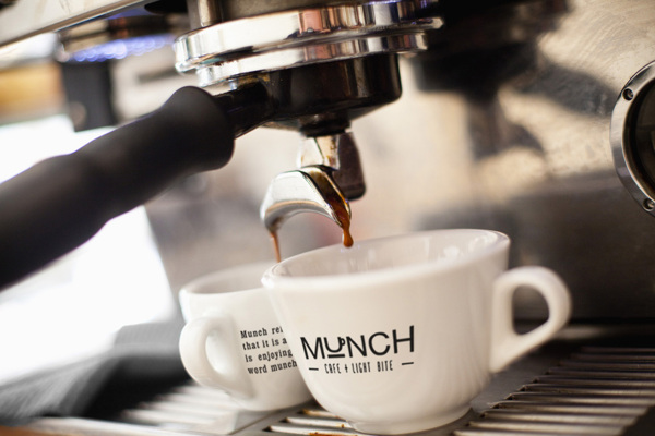
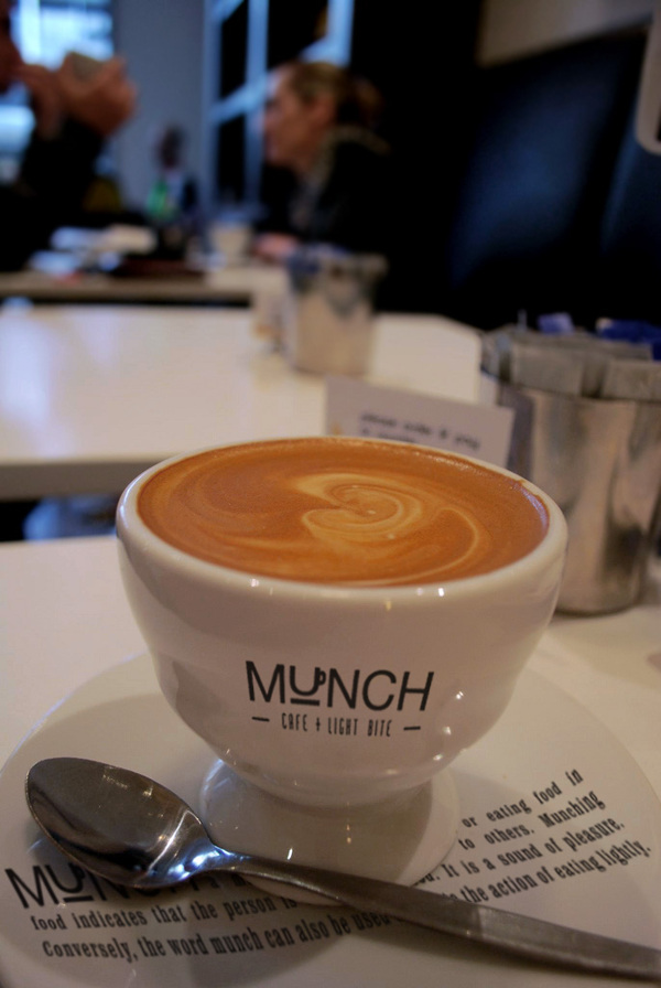
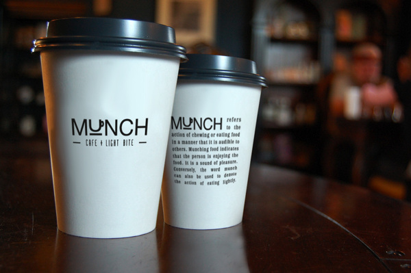
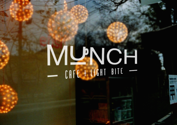
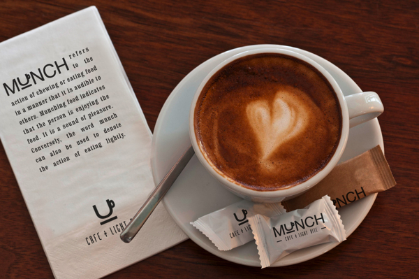
The brand identity for the cafe, Munch, is driven by heavy use of typography. Although I’m not usually a big fan of Helvetica (everyone uses it), the designer, Hazel Chong, executes an excellent design using it. The logo is simple typography with a mnemonic device in the place of the ‘U’ form. The U-shaped coffee mug sits perfectly in the logotype doing two things. First it clearly states what type of restaurant this is. Second it sets a tone of minimal style and design which is supported by the other element in the identity. I love the commentary used as a way to push the brand and establish a graphic element.

1e818c51babf99c1f8fca42b2fdb95f0

19e6d97d47956824acd6674b275864e7

26d6c64ea1ac80411a3dd05b51ad6c0e

69aa43798bfa397c592dcab2d1fc24da

98eeca0941d12c7b0f5eb6787aa77beb

e66203e48bcdfaaa90798359ed8cd424


Discuss this Project

Leave a Reply

This site uses Akismet to reduce spam. Learn how your comment data is processed.

The Forktales Podcast™: Interviews with restaurant industry leaders and visionaries

Restaurant and advertising industry headlines and thinking

Reviews of restaurant experiences from around the globe 

Reviews of our favorite design, business, & restaurant books

Our favorite typography and fonts

Inspiration in your inbox

Get the latest inspiration in your inbox every Monday morning, for FREE!

"*" indicates required fields

This field is for validation purposes and should be left unchanged.

Delicious Bits in your Inbox!

Get the latest and greatest content delivered to your inbox for free!

"*" indicates required fields

This field is for validation purposes and should be left unchanged.