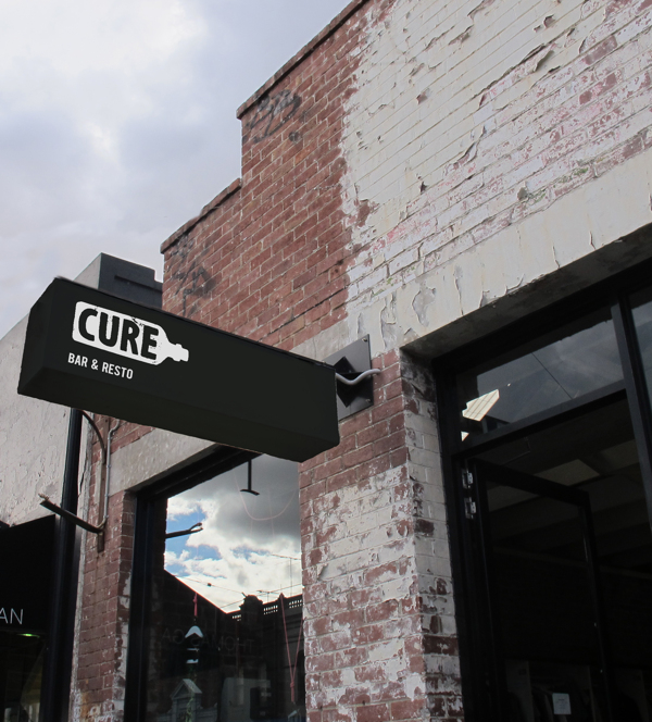
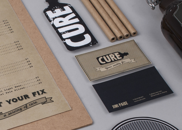
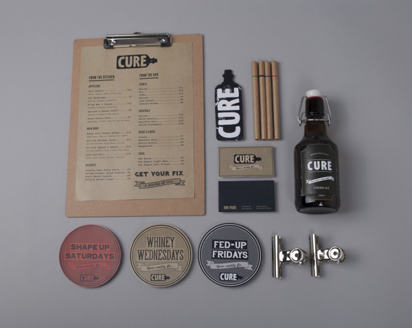
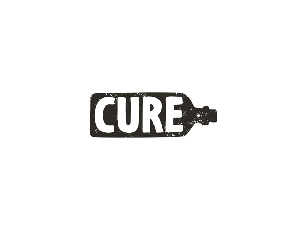
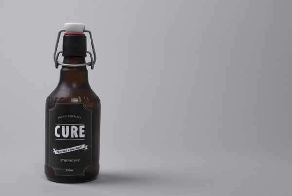
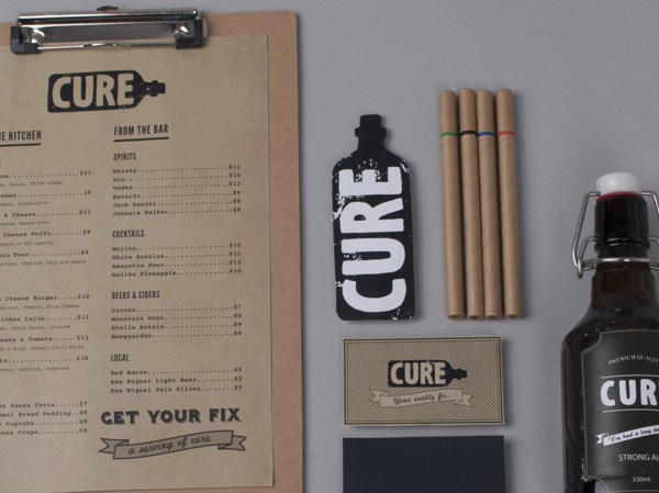
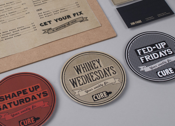
The simple black and white color palette pushes the textures found in the architecture and printed brand materials. Cure has a hipster-like style about it with that shabby-chic, urban decay vibe. The logo is simple, but gets the bar/booze point across quite literally. The other touch points build from its direction creating nods to old style design, while remaining rather modern. Designed by Bae de Jesus in the Phillipines.

2f437885c0c6d1c84273fd5f92a45436

4eaf6a83d3fa1a9c5e161934b2b7670e

6b472ad8580b1ded2ef51a32effee5c6

23d60adc90702562f474063f6c6c1705

29cf9506cc6e45172fc9b84b806d6975

92403d836db9683ddd251b209bff718c

e1feb211c63821fc36f88fec6ff3c2e6

Discuss this Project

One Response

Leave a Reply

This site uses Akismet to reduce spam. Learn how your comment data is processed.

The Forktales Podcast™: Interviews with restaurant industry leaders and visionaries

Restaurant and advertising industry headlines and thinking

Reviews of restaurant experiences from around the globe 

Reviews of our favorite design, business, & restaurant books

Our favorite typography and fonts

Inspiration in your inbox

Get the latest inspiration in your inbox every Monday morning, for FREE!

"*" indicates required fields

This field is for validation purposes and should be left unchanged.

Delicious Bits in your Inbox!

Get the latest and greatest content delivered to your inbox for free!

"*" indicates required fields

This field is for validation purposes and should be left unchanged.