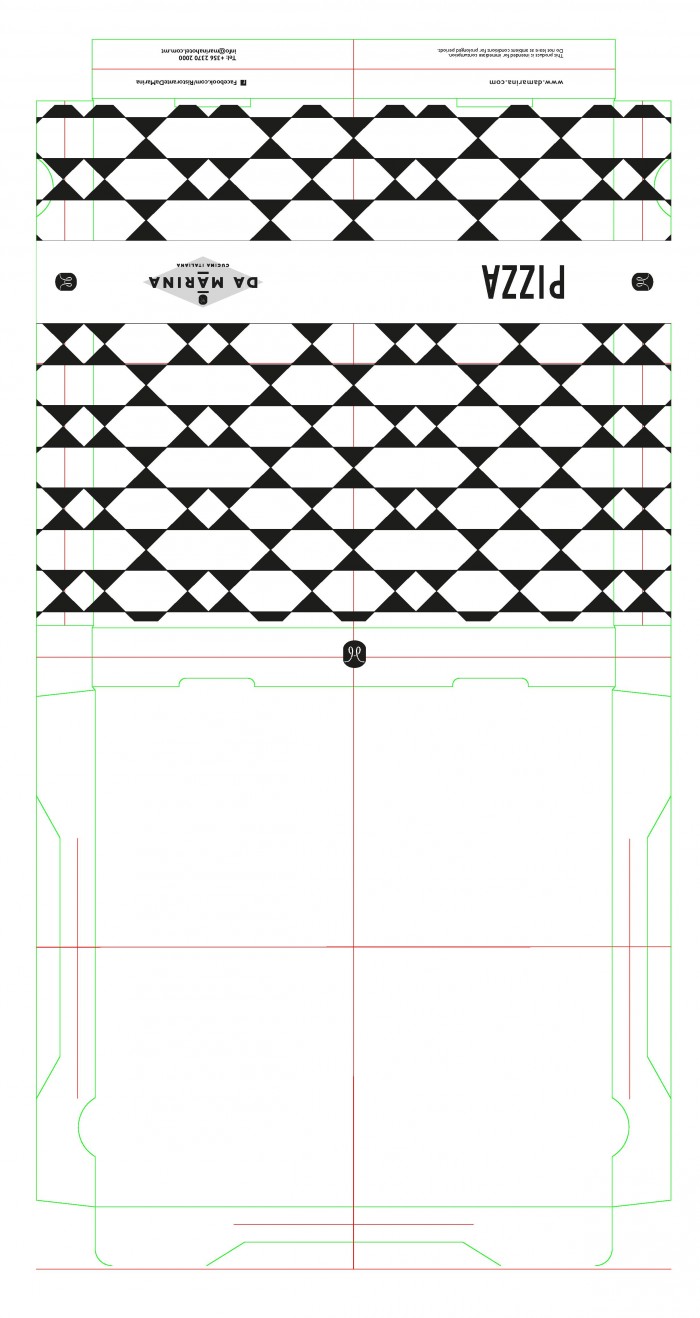
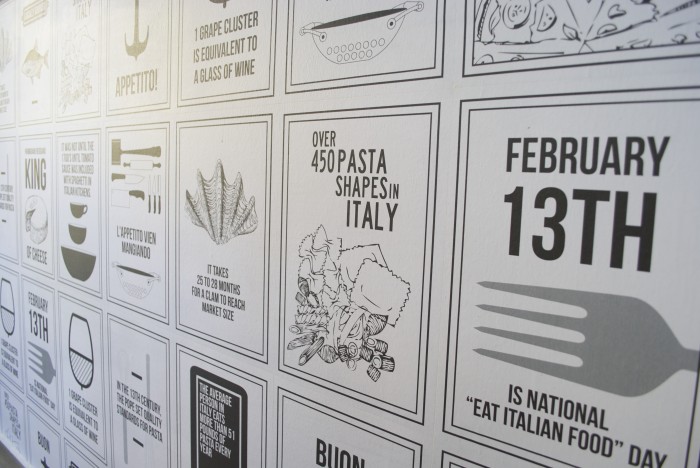
The team at Steves & Co designed up this fun italian restaurant brand. The simple, black and white color palette pops out with their illustrations and clean layouts. The series of posters create an awesome persona for the restaurant’s brand, and the supporting element help tie things together. The logo works well for the brand, but I would like to see it in other compositions where the mark is larger or used as an insignia. The design quality is there though making this restaurant’s brand identity top notch.


DaMarina Main-page-001

Da Marina pizza box-page-001

DSC_0025

DSC_0049

DSC_0193

DSC_0406

DSC_0504 copy

DSC_0367


Da Marina Menu-page-013

Da Marina Posters-page-004

Da Marina Posters-page-007


Da Marina Posters-page-012

Discuss this Project

Leave a Reply

This site uses Akismet to reduce spam. Learn how your comment data is processed.

The Forktales Podcast™: Interviews with restaurant industry leaders and visionaries

Restaurant and advertising industry headlines and thinking

Reviews of restaurant experiences from around the globe 

Reviews of our favorite design, business, & restaurant books

Our favorite typography and fonts

Inspiration in your inbox

Get the latest inspiration in your inbox every Monday morning, for FREE!

"*" indicates required fields

This field is for validation purposes and should be left unchanged.

Delicious Bits in your Inbox!

Get the latest and greatest content delivered to your inbox for free!

"*" indicates required fields

This field is for validation purposes and should be left unchanged.