L’antiquari tapas restaurant branding

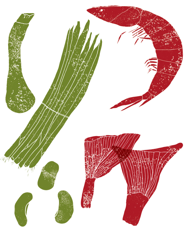
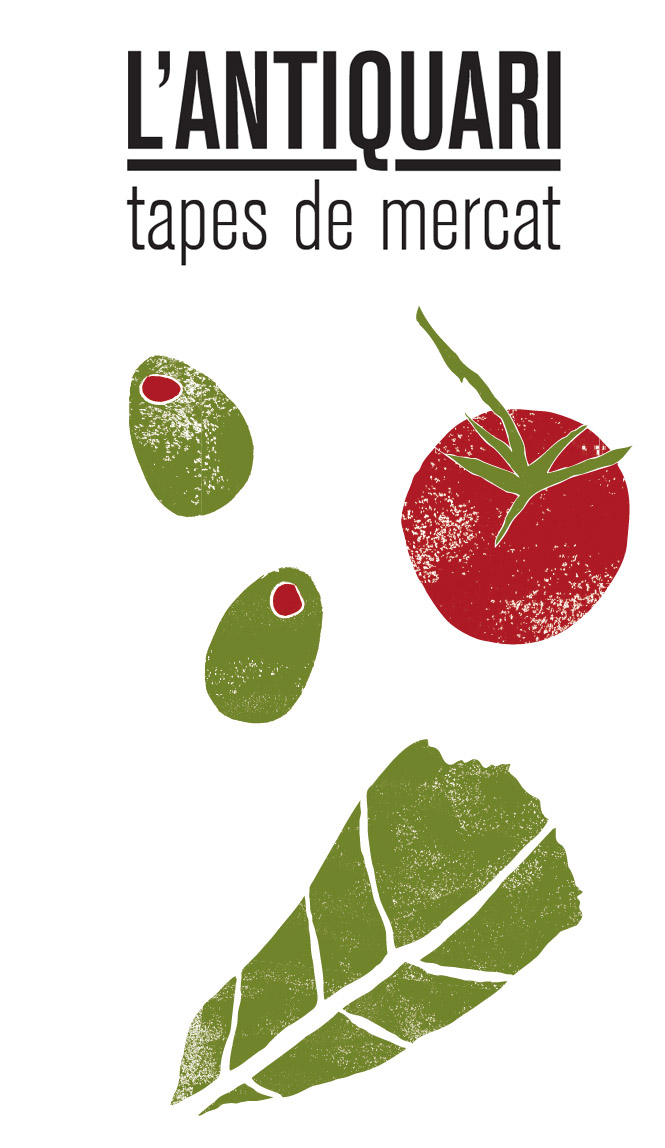
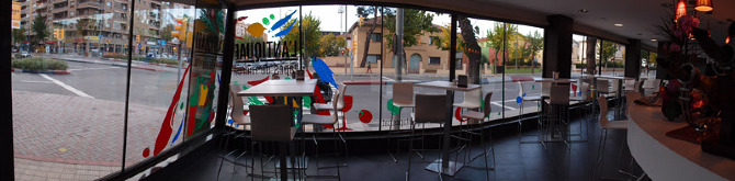
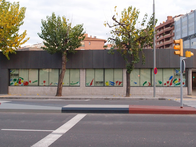
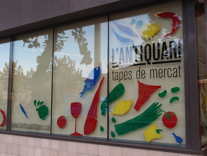
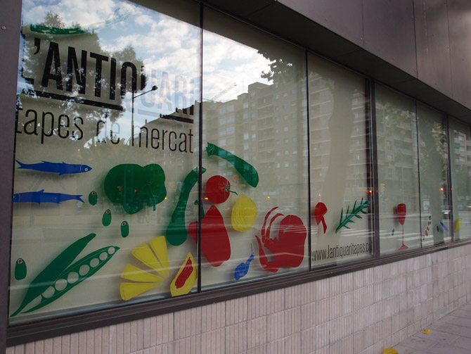
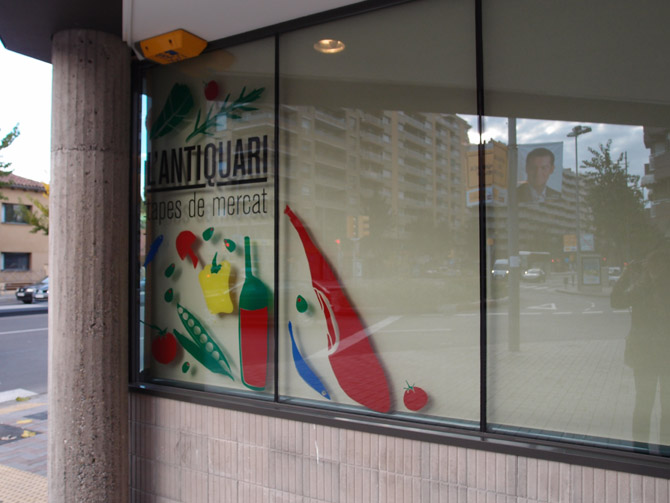
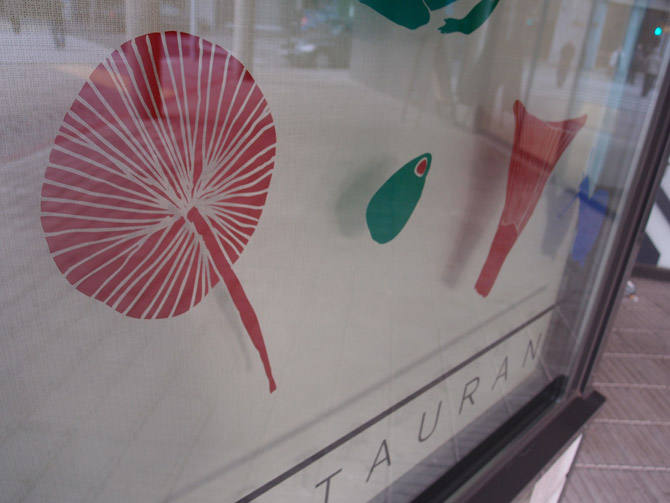
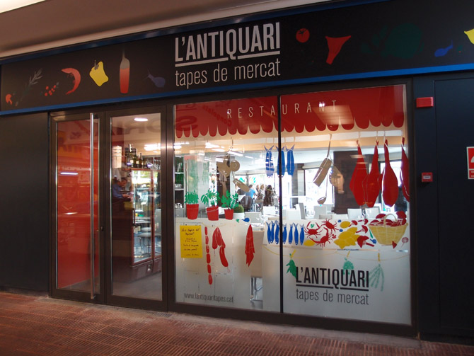
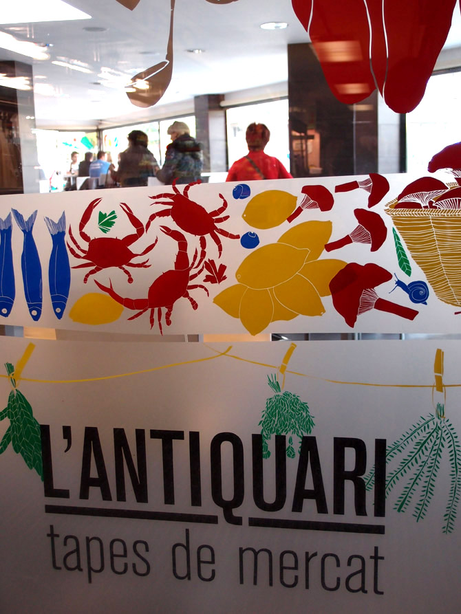
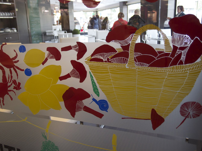
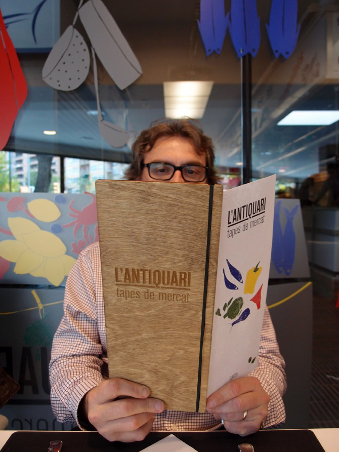
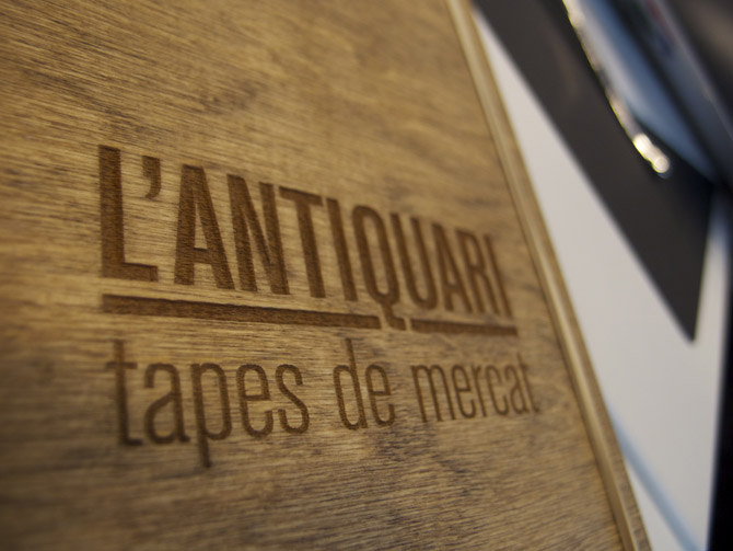
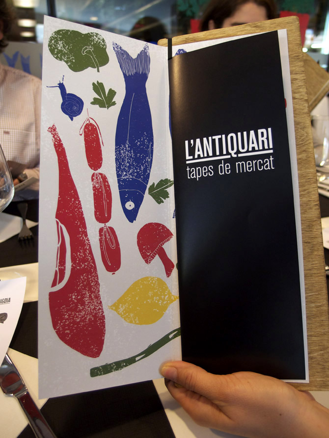
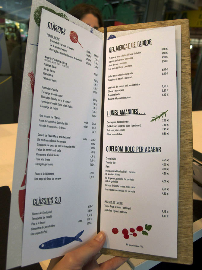
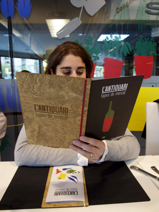
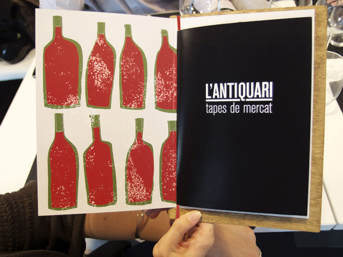
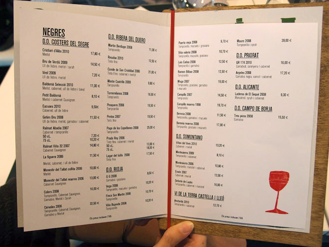
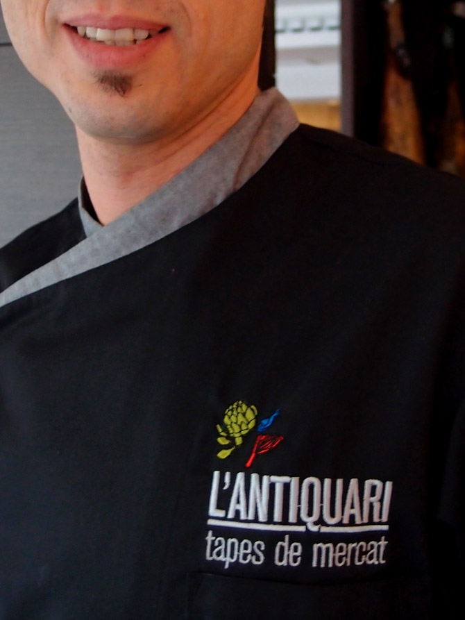
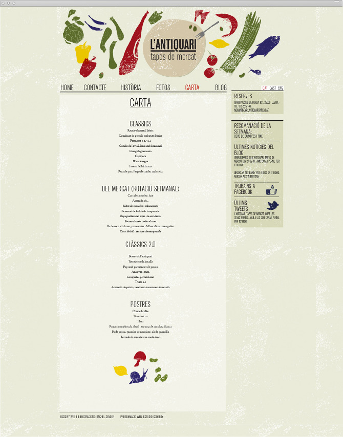
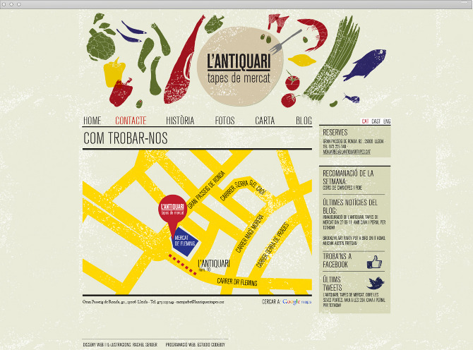
Rachel Sender‘s restaurant branding work for L’antiquari is not my personal style, but that doesn’t exclude it from excellence by any means. The design thinking is fresh, new and memorable. With pops of woodcut-meets-stamped illustrations in primary colors as the defining characteristic, Sender sets up ways to break convention in simple typography layouts. The illustrations unite the other touch points for the restaurant’s brand like a visual glue creating a dynamic look that goes beyond the logo’s simplicity.

Print

Print

Print

OLYMPUS DIGITAL CAMERA

OLYMPUS DIGITAL CAMERA

OLYMPUS DIGITAL CAMERA

OLYMPUS DIGITAL CAMERA

OLYMPUS DIGITAL CAMERA

OLYMPUS DIGITAL CAMERA

OLYMPUS DIGITAL CAMERA

OLYMPUS DIGITAL CAMERA

07

OLYMPUS DIGITAL CAMERA

PB173210

09

10

11


12

OLYMPUS DIGITAL CAMERA

OLYMPUS DIGITAL CAMERA

OLYMPUS DIGITAL CAMERA

lantiquari-web-CARTA

lantiquari-web-MAPA-01


Discuss this Project

Leave a Reply

This site uses Akismet to reduce spam. Learn how your comment data is processed.

The Forktales Podcast™: Interviews with restaurant industry leaders and visionaries

Restaurant and advertising industry headlines and thinking

Reviews of restaurant experiences from around the globe 

Reviews of our favorite design, business, & restaurant books

Our favorite typography and fonts

Inspiration in your inbox

Get the latest inspiration in your inbox every Monday morning, for FREE!

"*" indicates required fields

This field is for validation purposes and should be left unchanged.

Delicious Bits in your Inbox!

Get the latest and greatest content delivered to your inbox for free!

"*" indicates required fields

This field is for validation purposes and should be left unchanged.