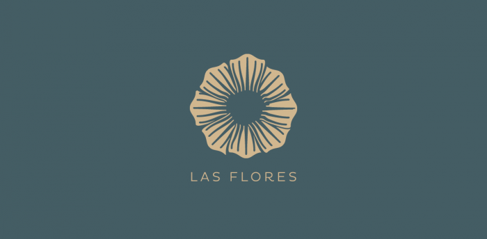
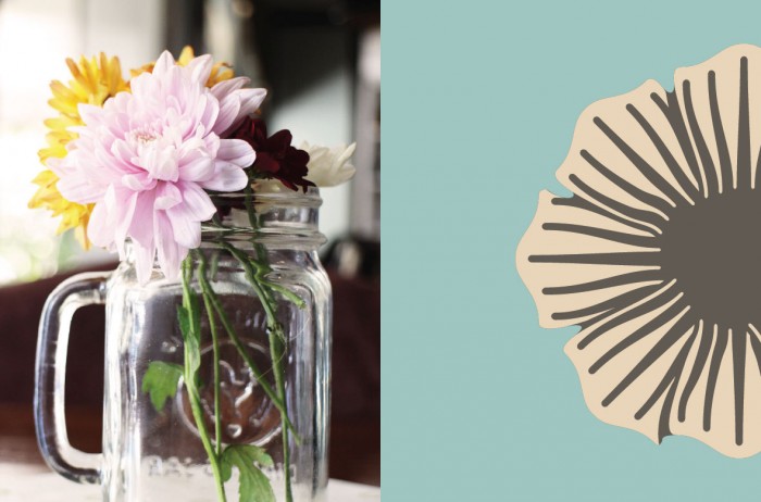
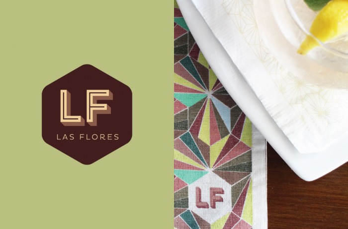
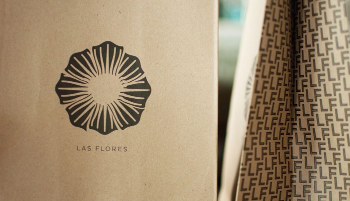
What’s interesting is when I first opened this project I thought it was going to be a super subdued, reserved identity. Based on the first two pictures it looks like Las Flores is going to take a classy, luxury look to the restaurant’s brand identity. However, as you scroll down the identity blooms beyond the reserved color palette into a graphic language and identity that’s much more dynamic.

aah-lf-1

aah-lf-2

aah-lf-3

aah-lf-4

aah-lf-5

aah-lf-6


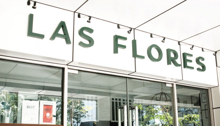
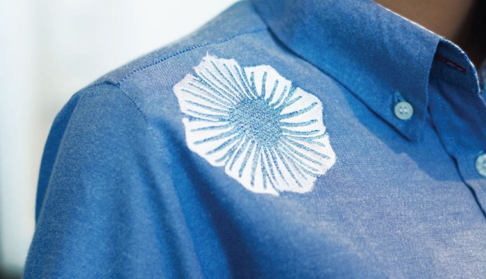
Something as simple as placing the brand mark in an uncommon area can make a brand start to have life.

aah-lf-7

aah-lf-8

aah-lf-9


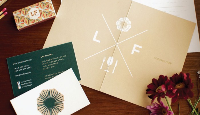
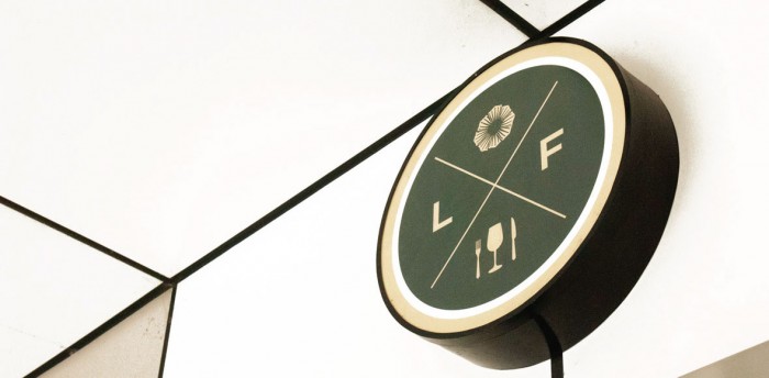
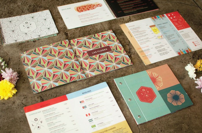
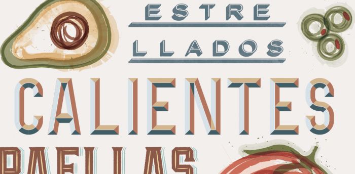
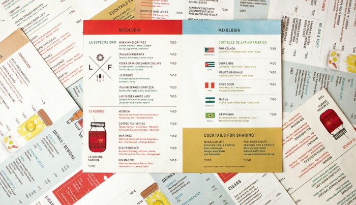
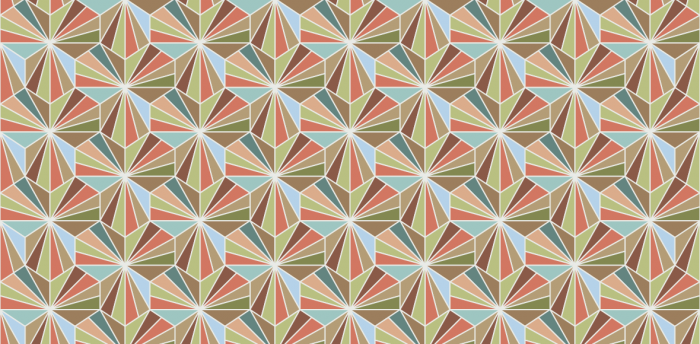
This is where things start to really liven up. The brand’s true identity flourishes with new, vibrant colors making it energetic, playful, and interesting. The patterns are fresh and new, and the print treatments are unique to pique intrigue.

aah-lf-10


aah-lf-11b

aah-lf-12

aah-lf-13

aah-lf-14

aah-lf-15

aah-lf-16

aah-lf-17

Designed by And A Half Studio in the Philippines

Discuss this Project

Leave a Reply

This site uses Akismet to reduce spam. Learn how your comment data is processed.

The Forktales Podcast™: Interviews with restaurant industry leaders and visionaries

Restaurant and advertising industry headlines and thinking

Reviews of restaurant experiences from around the globe 

Reviews of our favorite design, business, & restaurant books

Our favorite typography and fonts

Inspiration in your inbox

Get the latest inspiration in your inbox every Monday morning, for FREE!

"*" indicates required fields

This field is for validation purposes and should be left unchanged.

Delicious Bits in your Inbox!

Get the latest and greatest content delivered to your inbox for free!

"*" indicates required fields

This field is for validation purposes and should be left unchanged.