Home of the Brave cafe branding

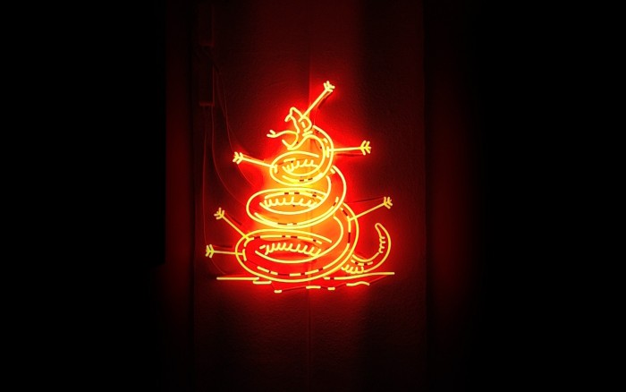
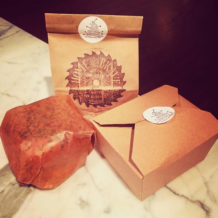
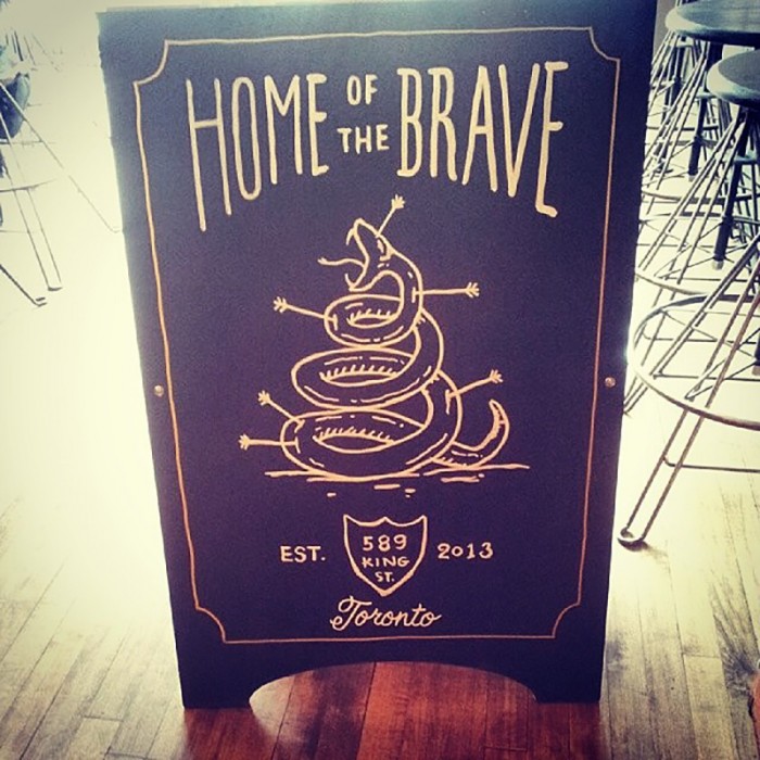
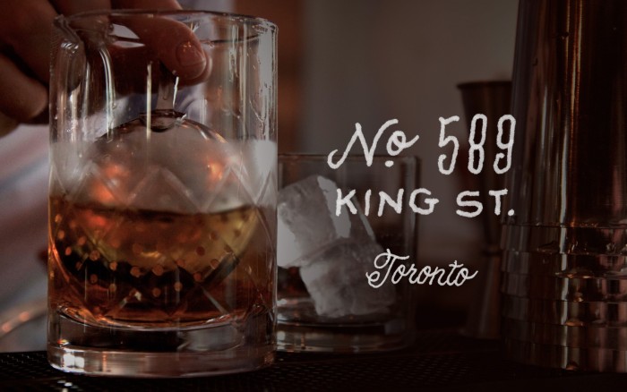
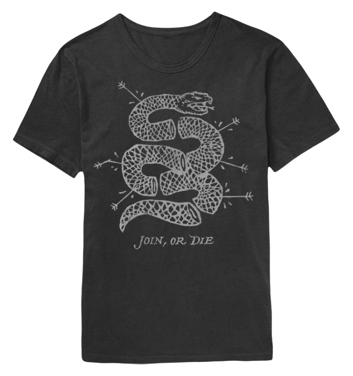
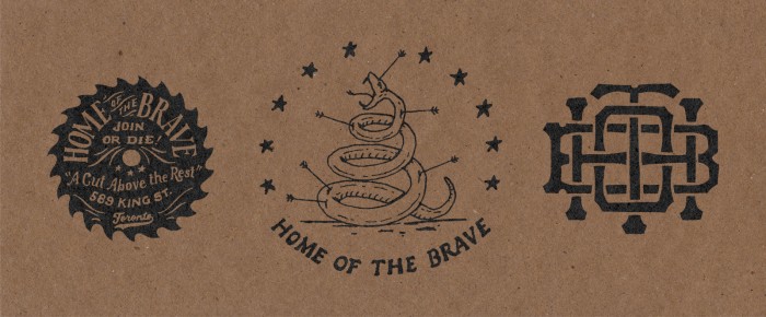
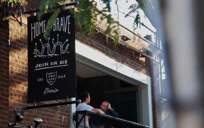
You have to love Jon Contino‘s work. It’s a distinct style and he’s one of the guys who’s brought hand crafted type and illustration back to the forefront of design. In this project he flexes some pro-American imagery and more of his iconic style. Home of the Brave takes patriotic inspiration and runs with historic one liners and some classic typography. The simple color palettes harkens back to days where multiple colors, sublimation and many other techinques just didn’t exist. This cafe’s identity shows a care for craft which one can only assume bleeds into their product and service.

hotb01

hotb07

hotb06

hotb08b

hotb4

hotb05

hotb02

Discuss this Project

Leave a Reply

This site uses Akismet to reduce spam. Learn how your comment data is processed.

The Forktales Podcast™: Interviews with restaurant industry leaders and visionaries

Restaurant and advertising industry headlines and thinking

Reviews of restaurant experiences from around the globe 

Reviews of our favorite design, business, & restaurant books

Our favorite typography and fonts

Inspiration in your inbox

Get the latest inspiration in your inbox every Monday morning, for FREE!

"*" indicates required fields

This field is for validation purposes and should be left unchanged.

Delicious Bits in your Inbox!

Get the latest and greatest content delivered to your inbox for free!

"*" indicates required fields

This field is for validation purposes and should be left unchanged.