Mt Atkinson Coffee

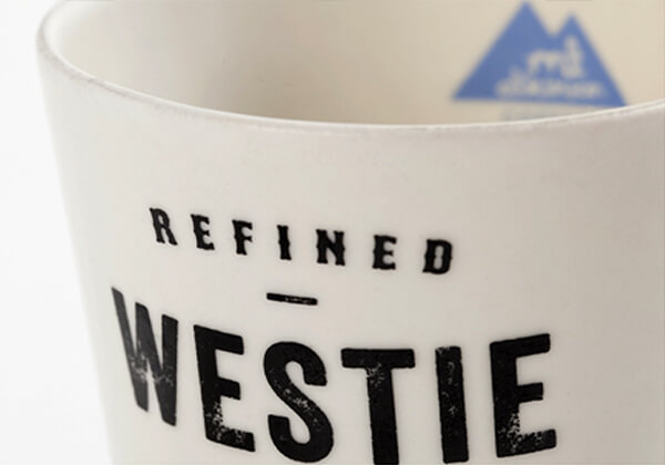
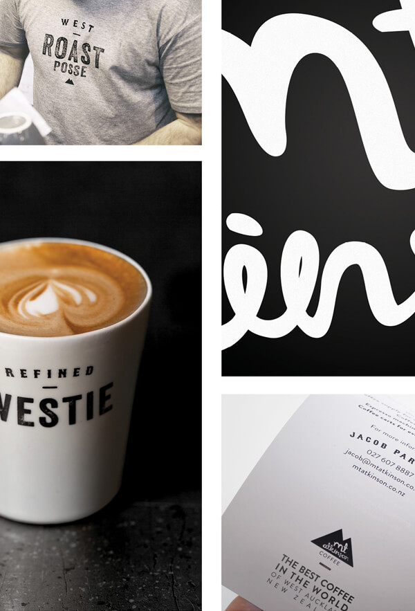
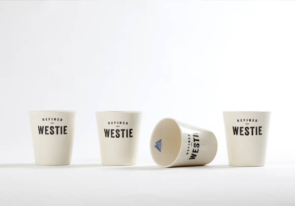
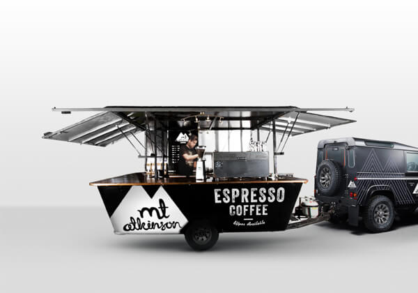
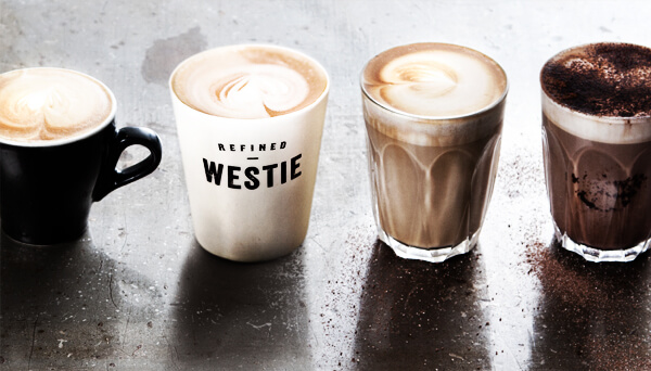
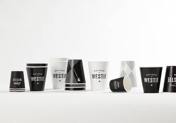
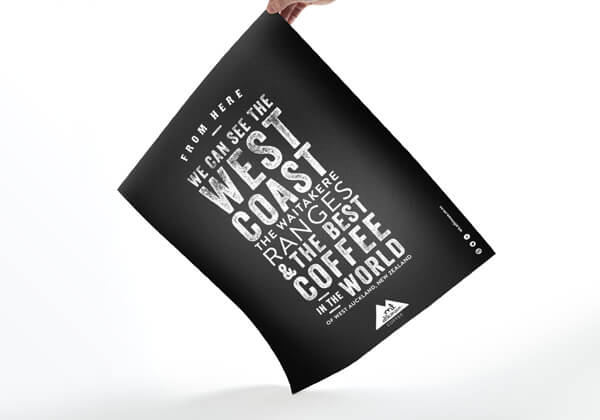
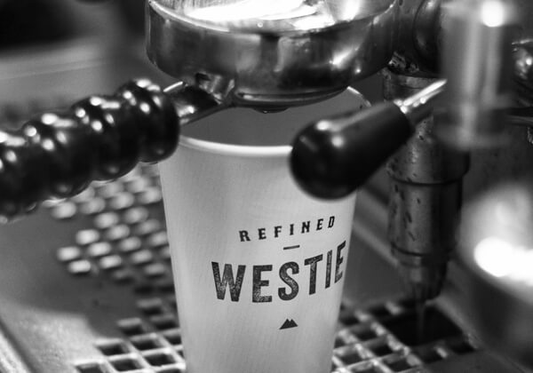
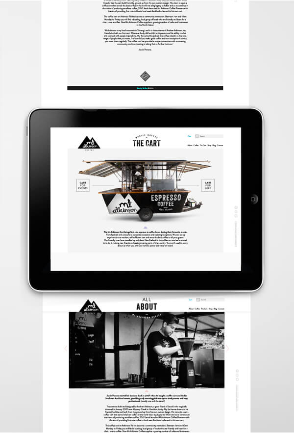
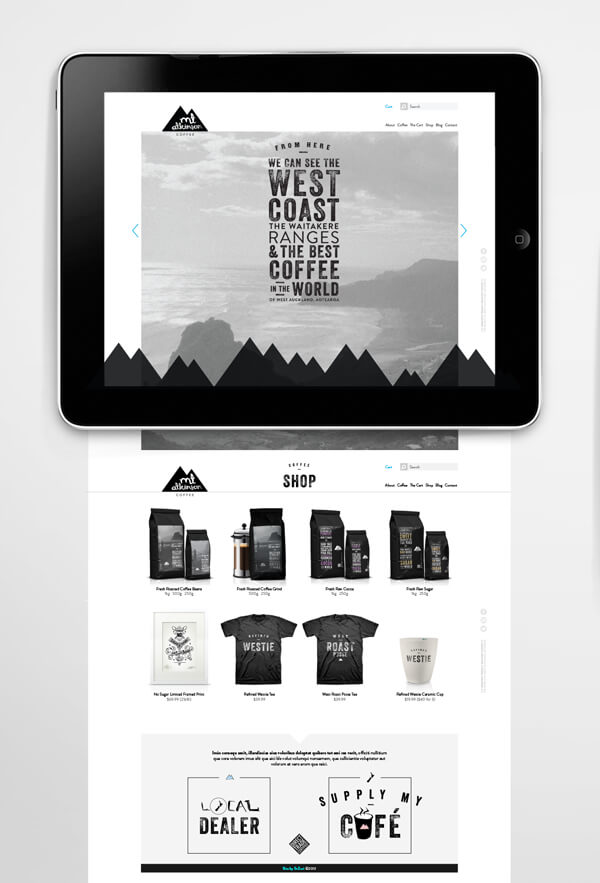
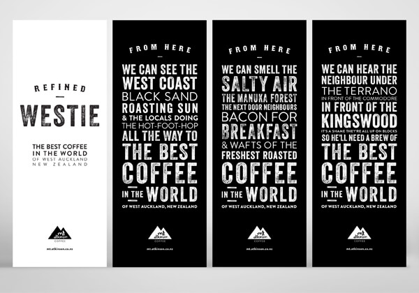
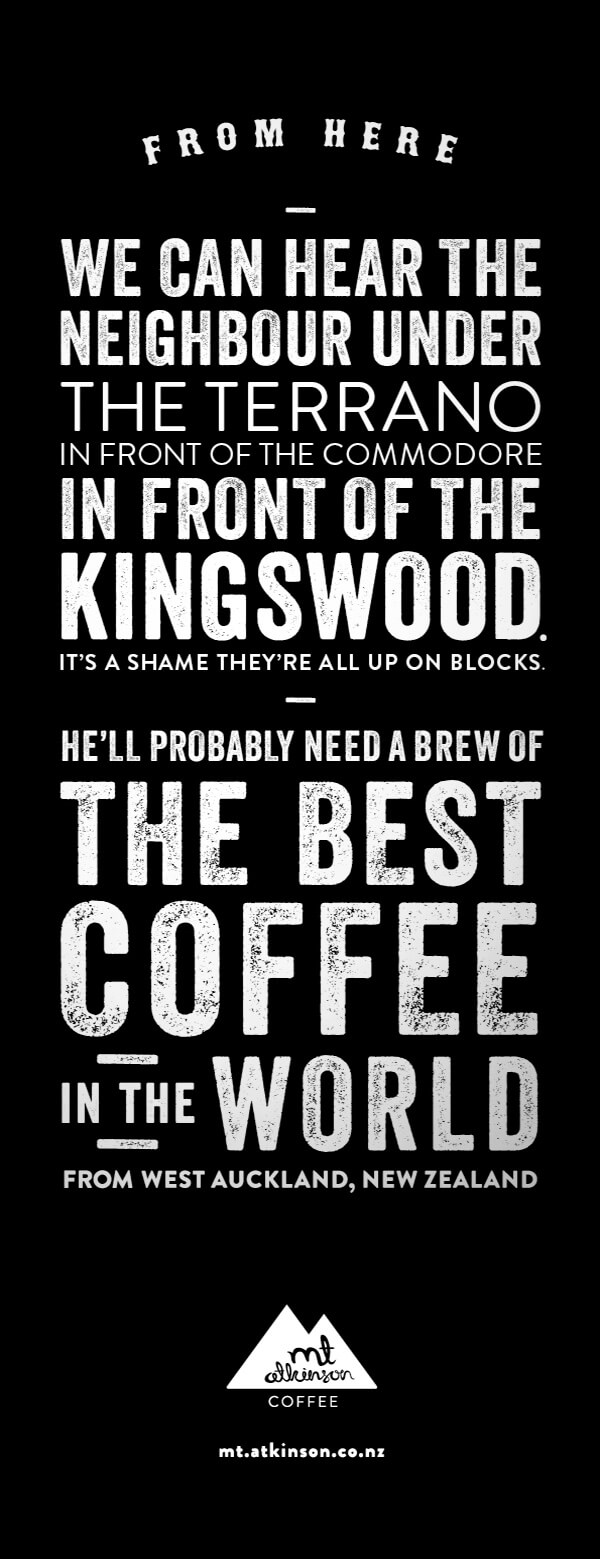
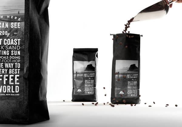
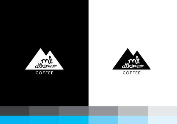
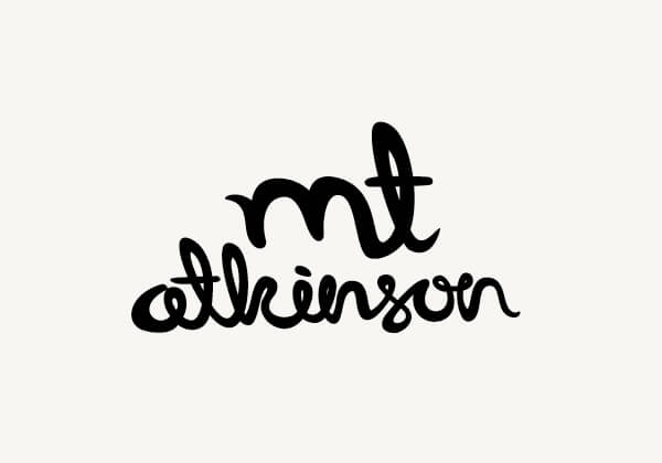
485 Design designed this black and white, no nonsense cafe identity from logo through packaging and everything in between. The cafe’s brand uses bold typography with a slight distress, and a black and white palette to make a statement about their attitude. It visually communicates a direct, confident vibe, while injecting moments of pride. The design for the mobile coffee shop is a game changer. It’s fresh, new, and in the style of the cafe’s brand. I’d love to hear your thoughts. Please share!

MtAtkinson_ceramic

MtAtkinson_grid1

MtAtkinson_ceramics

MtAtkinson_cart

MtAtkinson_coffee

MtAtkinson_cups

MtAtkinson_poster

MtAtkinson_pour

MtAtkinson_web2

MtAtkinson_web1

MtAtkinson_typestories

MtAtkinson_type

MtAtkinson_packs

MtAtkinson_colours

MtAtkinson_script

MtAtkinson_logo


The Forktales Podcast™: Interviews with restaurant industry leaders and visionaries

Restaurant and advertising industry headlines and thinking

Reviews of restaurant experiences from around the globe 

Reviews of our favorite design, business, & restaurant books

Our favorite typography and fonts

Inspiration in your inbox

Get the latest inspiration in your inbox every Monday morning, for FREE!

"*" indicates required fields

This field is for validation purposes and should be left unchanged.

Delicious Bits in your Inbox!

Get the latest and greatest content delivered to your inbox for free!

"*" indicates required fields

This field is for validation purposes and should be left unchanged.