Friedman’s Catering Branding

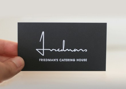
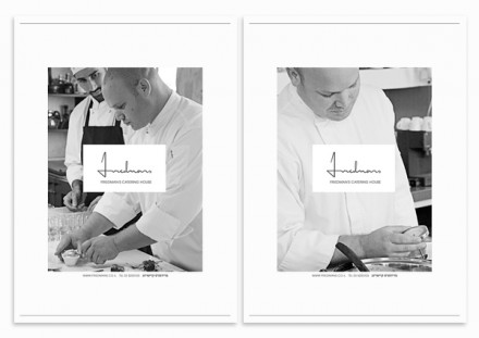
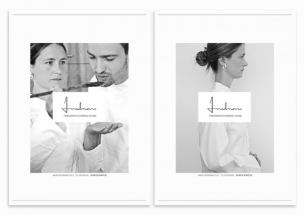
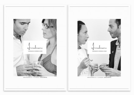
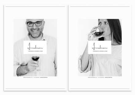
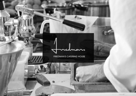
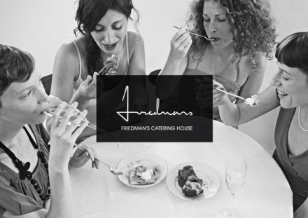
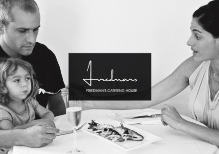
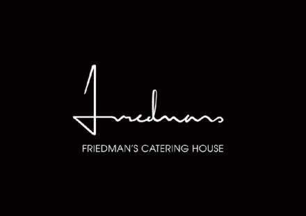
The brand for Friedman’s Catering is bolstered by strong black and white photography that sets a tone of artsy, high end experiences. The logo itself is a simple scrawl of the word “Friedmans” in black and white as well. The entire brand itself is chic and it makes no excuses for its simplicity. It gives one the feeling that the food speaks loud enough. Designed by Nurit Koniak.

Discuss this Project

Leave a Reply

This site uses Akismet to reduce spam. Learn how your comment data is processed.

The Forktales Podcast™: Interviews with restaurant industry leaders and visionaries

Restaurant and advertising industry headlines and thinking

Reviews of restaurant experiences from around the globe 

Reviews of our favorite design, business, & restaurant books

Our favorite typography and fonts

Inspiration in your inbox

Get the latest inspiration in your inbox every Monday morning, for FREE!

"*" indicates required fields

This field is for validation purposes and should be left unchanged.

Delicious Bits in your Inbox!

Get the latest and greatest content delivered to your inbox for free!

"*" indicates required fields

This field is for validation purposes and should be left unchanged.