Harvey’s at Union Square Restaurant Branding

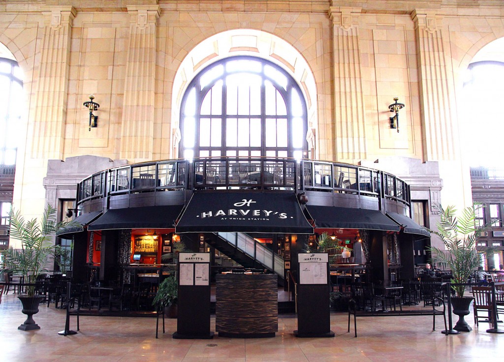
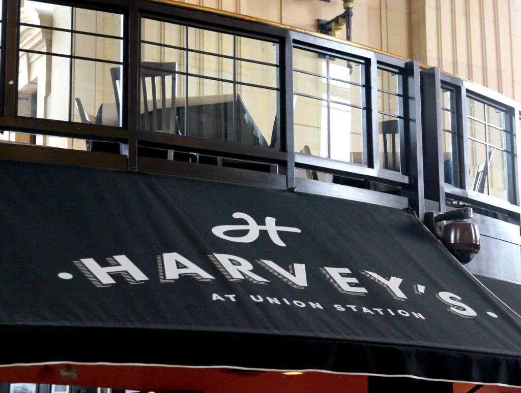
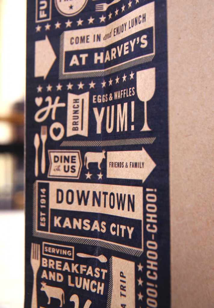
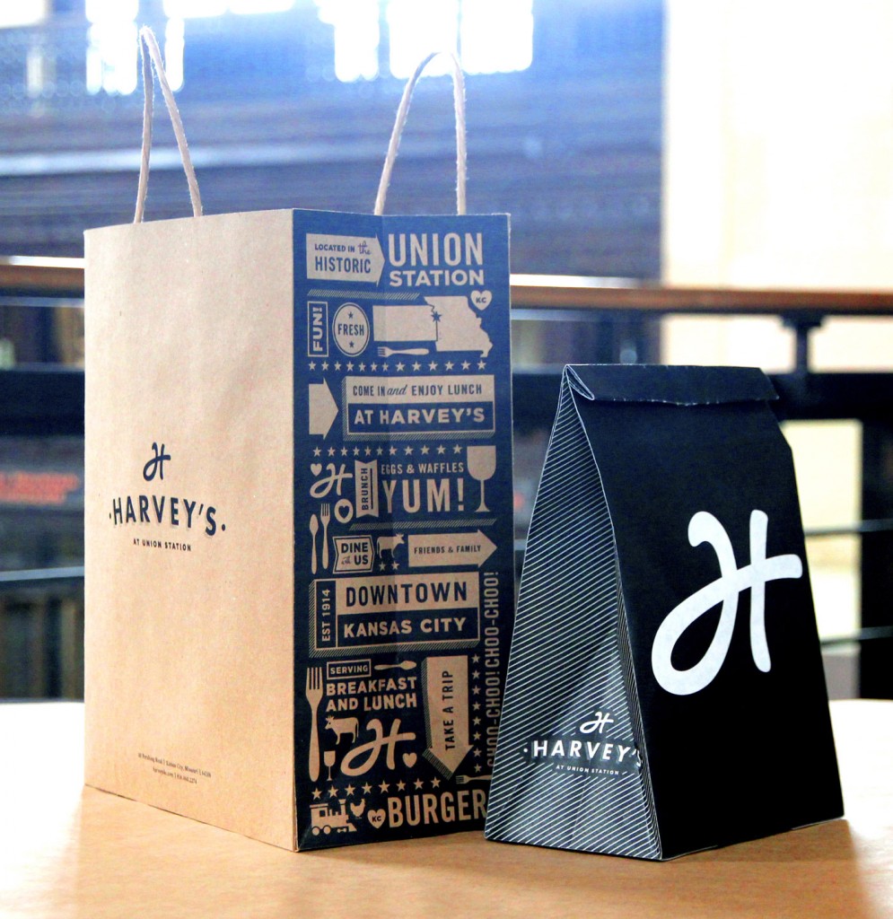
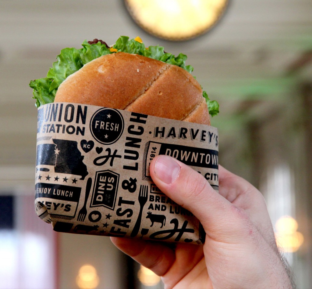
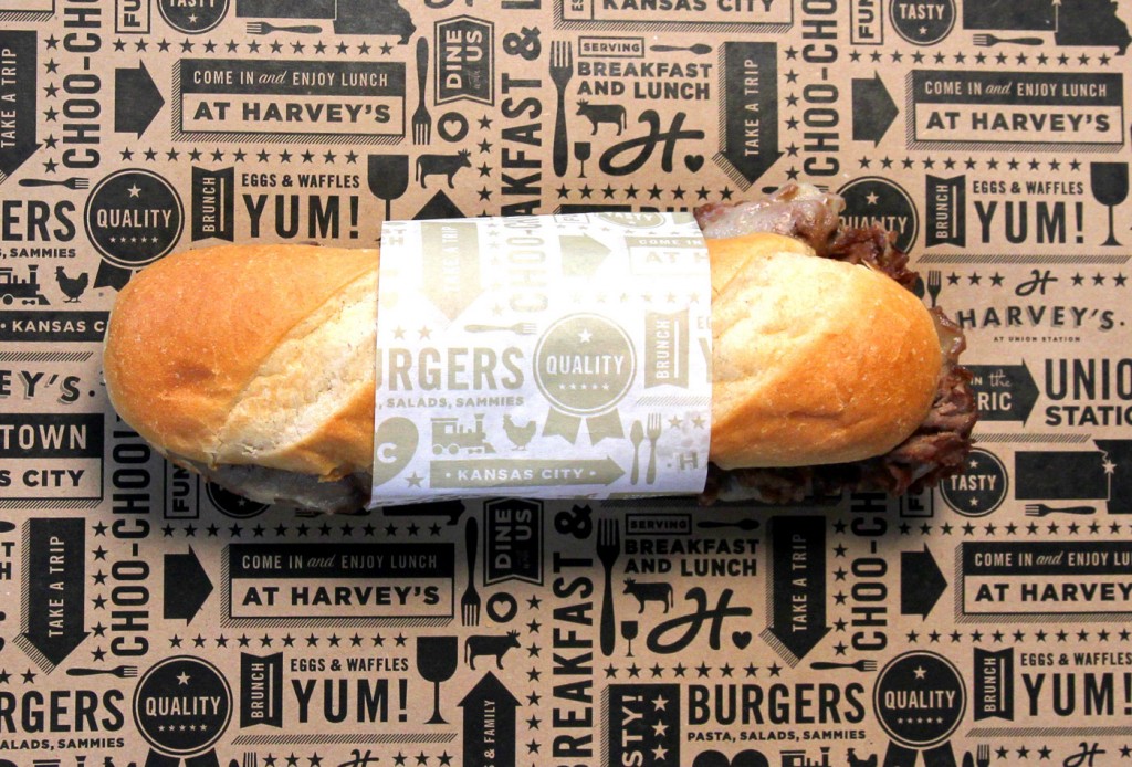
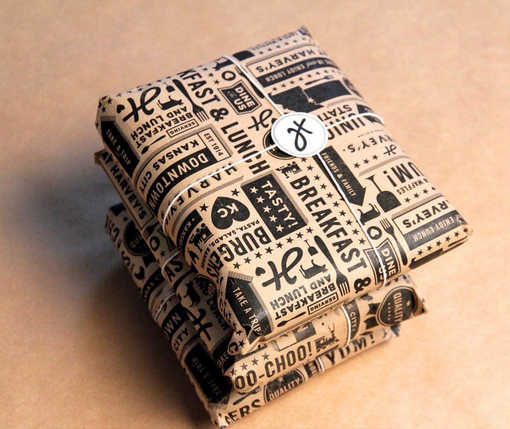
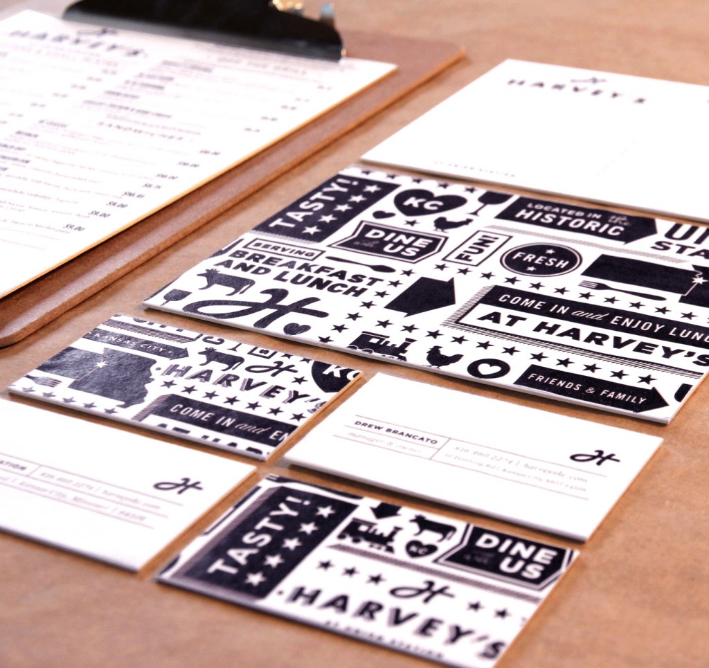
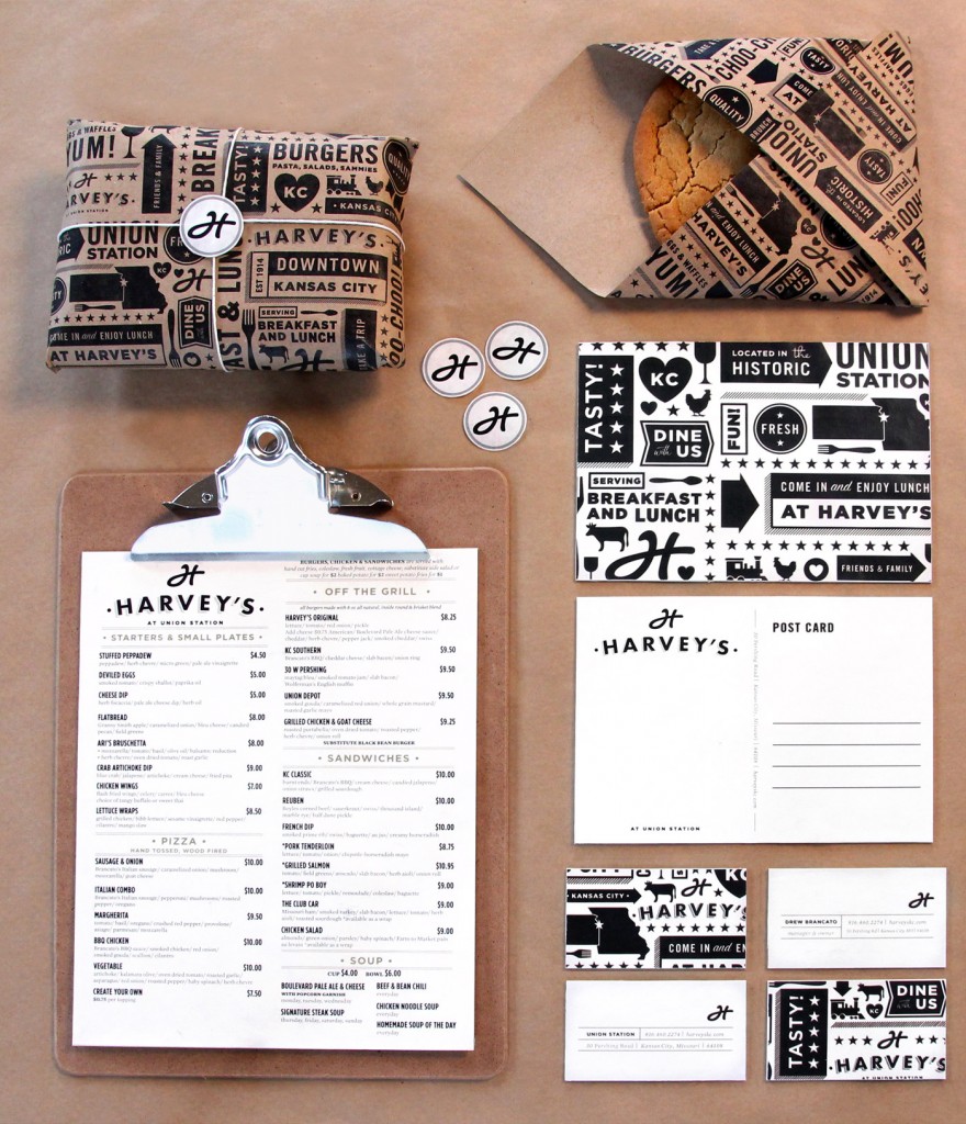
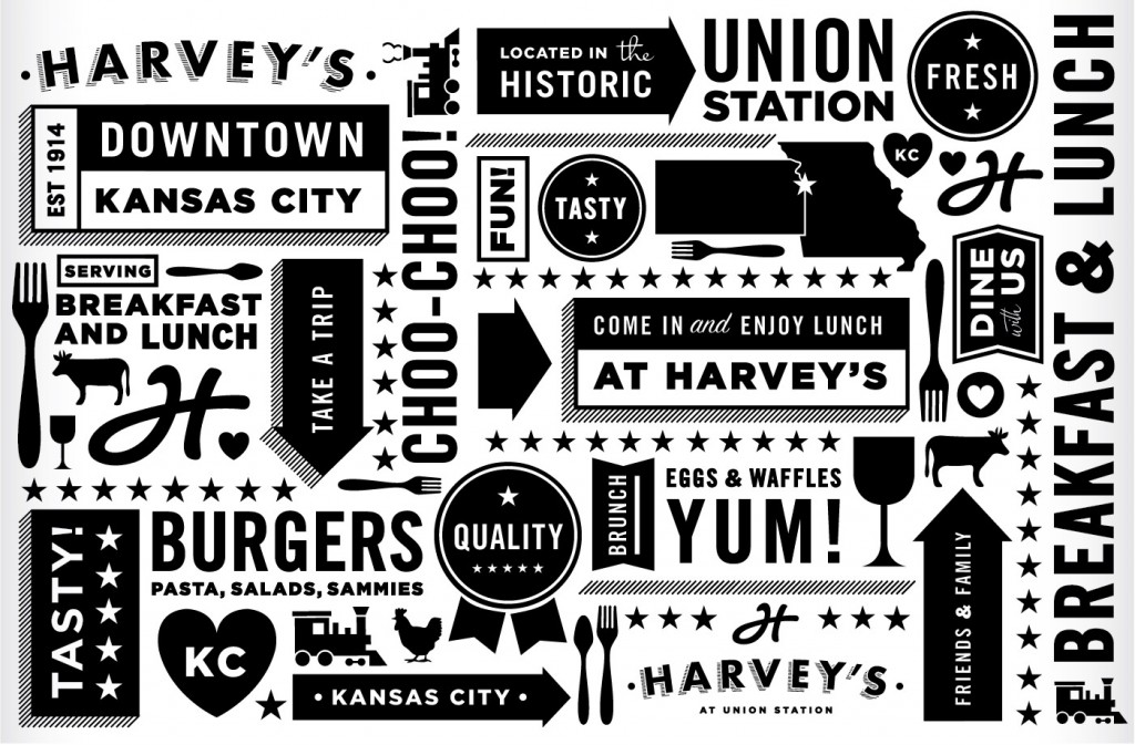
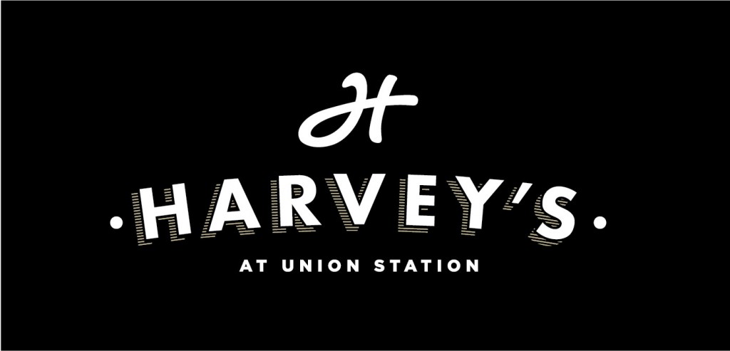
Tad Carpenter has a unique, distinct style when it comes to design and illustrator. It’s a style that works. Pulling from classic design treatments and melding with more modern, clean illustrations makes Harvey’s a superb transitional style brand. A lot of restaurants are opting for a style I’ve starting calling “transitional” because it rides the middle area between the old and the new. The old brings with it the traditional understanding of what a restaurant should be and the new tells the story of a fresh way of doing things. Believe it or not, it’s the perfect way to deliver on that age-old client direction of “i want it black, but also white.” And those colors are exactly what signify the Harvey’s at Union Station brand. Great job Tad and team. Keep up the great work.

harveys110_tadcarpenter

harveys10_tadcarpenter

harveys09_tadcarpenter

harveys08_tadcarpenter

harveys07C_tadcarpenter

harveys07B_tadcarpenter

harveys07_tadcarpenter

harveys06_tadcarpenter

harveys05_tadcarpenter

harveys04_tadcarpenter

harveys03_tadcarpenter-11

harveys02_tadcarpenter

harveys01_tadcarpenter

Discuss this Project

Leave a Reply

This site uses Akismet to reduce spam. Learn how your comment data is processed.

The Forktales Podcast™: Interviews with restaurant industry leaders and visionaries

Restaurant and advertising industry headlines and thinking

Reviews of restaurant experiences from around the globe 

Reviews of our favorite design, business, & restaurant books

Our favorite typography and fonts

Inspiration in your inbox

Get the latest inspiration in your inbox every Monday morning, for FREE!

"*" indicates required fields

This field is for validation purposes and should be left unchanged.

Delicious Bits in your Inbox!

Get the latest and greatest content delivered to your inbox for free!

"*" indicates required fields

This field is for validation purposes and should be left unchanged.