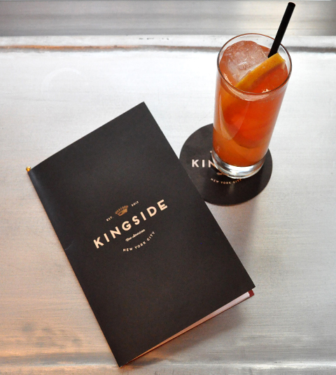
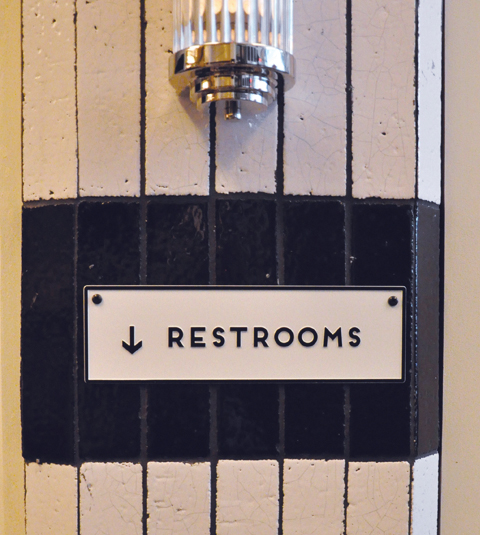
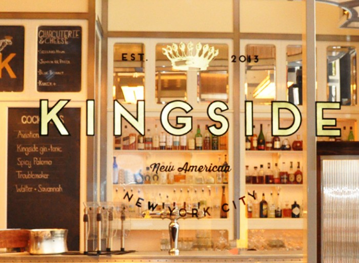
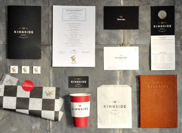
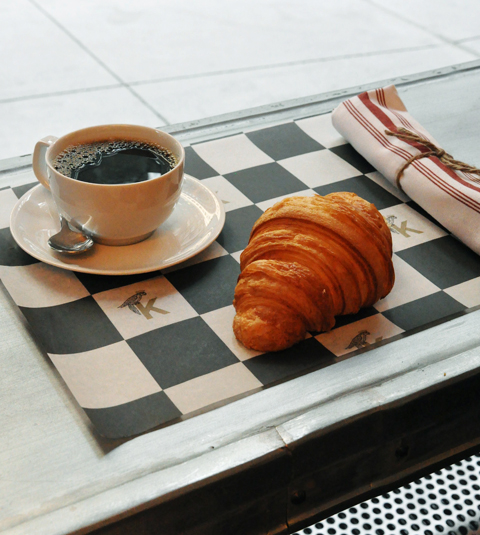
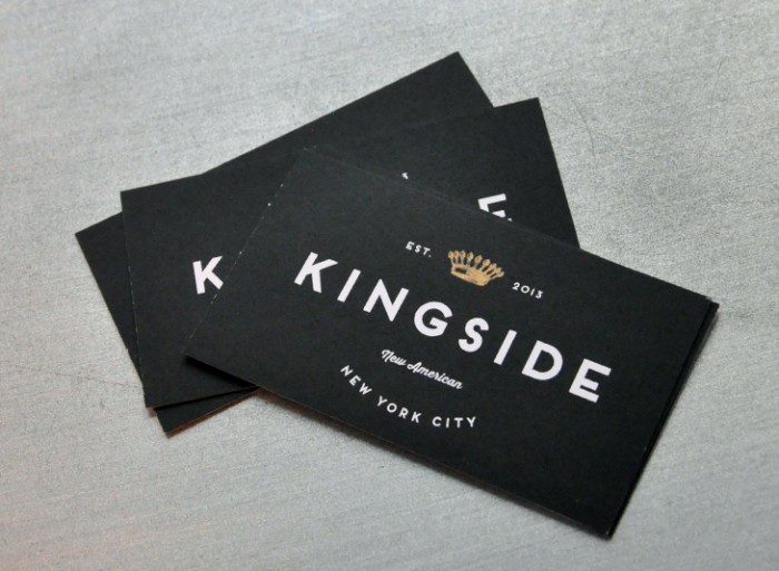
The creative studio LMNOP designed up this lovely identity for Kingside, a restaurant in New York City. There are a lot of classic style elements happening between the physical space design and the brand identity. This happens in often with NYC based restaurants. A lot seem to fall into the classic Art Deco influences like gold flake lettering, tile floors, etc. Not a complaint, just an observation. The way LMNOP melds that influence into a fresher identity through the menus and other touch points is excellent. Some elements could use a little diversity and extra thought. They all carry the logo front and center. Although it looks great, it gets a little monotonous. That’s the only criticism I have for this excellent display of design work.

KS_6

KS_7

KS_8

KS_1

KS_2

KS_3

KS_4

Discuss this Project

Leave a Reply

This site uses Akismet to reduce spam. Learn how your comment data is processed.

The Forktales Podcast™: Interviews with restaurant industry leaders and visionaries

Restaurant and advertising industry headlines and thinking

Reviews of restaurant experiences from around the globe 

Reviews of our favorite design, business, & restaurant books

Our favorite typography and fonts

Inspiration in your inbox

Get the latest inspiration in your inbox every Monday morning, for FREE!

"*" indicates required fields

This field is for validation purposes and should be left unchanged.

Delicious Bits in your Inbox!

Get the latest and greatest content delivered to your inbox for free!

"*" indicates required fields

This field is for validation purposes and should be left unchanged.